DIGM 3351: Graphic Production Process Control 1
In 3351 I learned job engineering of graphic production, techniques used to reproduce varying types of original signatures, tone capture and correction, soft and hard proofing, start of platesetting, and final output. I now fully understand these processes and can effectively calculate how much time may be needed for the job and be aware of the various problems that might occur.
ckicking the images below will open a pdf in new tab.
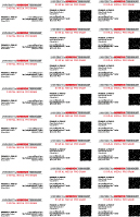

Customized then Imposed in a new InDesign 6 file using the “step and repeat” command. QR code was generated with the Demo InDesign plug-in.
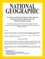
Built from scratch with captured Microsoft Word text carefully spaced using points and picas all in Adobe InDesign 6. Printed on paper larger than document’s size to accommodate the bleed off of a Xerox Phaser 7500DX Color Printer.
All made from scratch with captured Microsoft Word text carefully measured from original document then spaced using points and picas all in Adobe InDesign 6. When printed the gradient has what is called banding. It occurs when two similar shades clash creating parallel lines. To fix this we should change the lpi to fit the printer.
This is to show the difference between raster and vector images and why raster images should not be up-scaled and why vector can be.
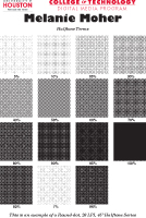
An example of how halftone dots look like and work. These are scaled so you can see them usually these are so small you can’t distinguish them, hence why printing is an optical illusion. The 45° angle is the best angle because it is the least noticeable and prevents moiré. Round dots are also used for nonorganic items.

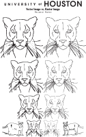
Customized Adobe InDesign 6 document using a self-taken photograph to show many ways to use special effects rendered in Photoshop to create images that “pop”.
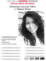
To further understand why no dot gain is darker, look here. Notice the grayscale at the bottom, the smallest possible dot you can get from this particular press is about 5 or 6 and the highest is around 90. This is called fingerprinting, measuring the press’ characteristics so we know how to get the best quality production from it. The density of the paper also plays a role in this process.
Measured the darkness of the key color, black, in Photoshop then calculated the approximate ink density using the proper equation.
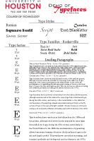
Made from scratch Adobe InDesign 6 document to show understanding for typefaces, type styles, families, leading, and series.
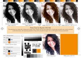
The 8 page booklet which had a requirement of 4 different types of images: scanned line art and images, digital images, and vector images. We could chose the content and design. After designing the file was imposed in Kodak’s PREPS software and burned to plates. I then self-printed on Ryobi 3302 HA 2 color offset lithographic printing press, folded, stitched, and cut with a Graphtec FC4510-60 Flat Bed Cutter.
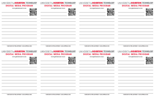
Customized then Imposed in a new InDesign 6 file using the “step and repeat” command.
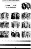
This is to show off duotone and the difference between no dot gain and 20% dot gain. The original is there as well as the color added to create the duotone as references. With no dot gain you get and image that is too dark, with 20% dot gain you get an image that looks fairly nice. In the duotone you want an image that is sepia looking. The one to the left is too bright so the one on the left would give a better result.
All Images (c) Melanie Moher