Paul Avendano's Web Site


The final product is a 4 x 5 notepad. This was imposed in Adobe InDesign and step and repeat was used. It was printed on 11 x 17 inch paper, and it was then cut and bounded together.
Adobe InDesign was used to design the business card from scratch. XMPie was used to generate a QR code. Once one of the cards was designed, step and repeat was used. Two versions were created and printed on 11 x 17 paper and then it was cut to.
The text in this document was already created using Microsoft Word. The text was imported into Adobe InDesign and different styles and leading were applied throughout the document.
Adobe InDesign was used XMPie was used to create Variable text Data for different customers. The data that was used was the customer’s information and photos that were taken from a database.
The text that is inside this pamphlet was taken from a word document, and then it was updated. A gradient was used for the cover and the stars were made more transparent the further down they went.
A photograph was taken and in Adobe Photoshop it had different effects placed on it. The effects that were used were postureization, phantom, and inverted.
A sample was given, but the document was made from scratch in Adobe InDesign. The document shows all of the different type styles, families, leading and series.
For this assignment I had to measure different areas and measure the different values from Adobe Photoshop, and after that I calculated the density.
This assignment shows what halftone dotes look like. I learned that the best angle to use is 45 degrees, because at that angle the dots are not as noticeable, and it prevents Moire from showing. Round dots are used on non-organic items.
For this assignment I got a densitometer to measure all the different spots of grayscale. I put the range on the bottom of the page, and this assignment showed me the characteristics of the press, and from knowing that then I could know which dot gain to use.
This assignment helped show how dot gain can effect images by applying 20%, 30%, and no dot gain. After printing this page out I got to see which profile was the best to use.
Adobe Photoshop was used in applying all of the different tones. I first started with a RGB image and then I converted it to a grayscale profile. It then had two different curves applied to the image. There is a screen shot of the curve used in the photograph.
This assignment was created in Adobe InDesign and it showed me that different printers have their own personalities. I learned that printers can compensate for a printers personality by changing the dot gain. By doing that they can make the image look better.
This assignment was created in Adobe InDesign. There was one image that was used and they were scaled to different sizes. The vector half shows how terrible an image looks when its scaled different. The same image was used but it was made into a vector image using Adobe Illustrator. The vector image isn’t effected at all when its scaled larger.
This assignment is an 8 page booklet that was created in Adobe InDesign. It was printed on 8 ½ X 11 inch paper. It was then imposed and printed on Genie. After printing, the 8-page booklet was trimmed on a Titan 265 cutting machine. After cutting, the papers were put through a folding machine, which bi-folded the booklet. After folding, the printed piece was saddle stitched on the saddle stich machine.
For this assignment there were different types of lighting and white balance used. There is a picture graph that was used in Adobe Photoshop to help correct the photograph. There was a X1 ColorChecker in the photograph that was used to establish a good curve.
For this assignment Adobe Photoshop was used to color this graphic using different CMYK values. The graphic was then trapped. The CMYK values that were used are pictures below showing their color along with rich black.
For this assignment Adobe Illustrator was used to show trapping between different shapes and colors.
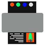
For this assignment several things were done in order to complete it. In Adobe Photoshop an old photograph was scanned and the colors were fixed and restored. Another image had its colors changed and a tiger inserted in the photo; that was in Adobe Photoshop. The pictures were then placed in Adobe InDesign and the booklet was laid out. The InDesign file was then created into a PDF file and that PDF file was put into Preps in order to created printing plates. After the plates were created then they were put into a Ryobi two-color press, where they were printed using four colors. It was then folded, stitched and cut into the final product.
<
>
3 - 3